Finominal
Redesigned portfolio analysis workflows for professional investors. Built and shipped features end-to-end using Claude Code.
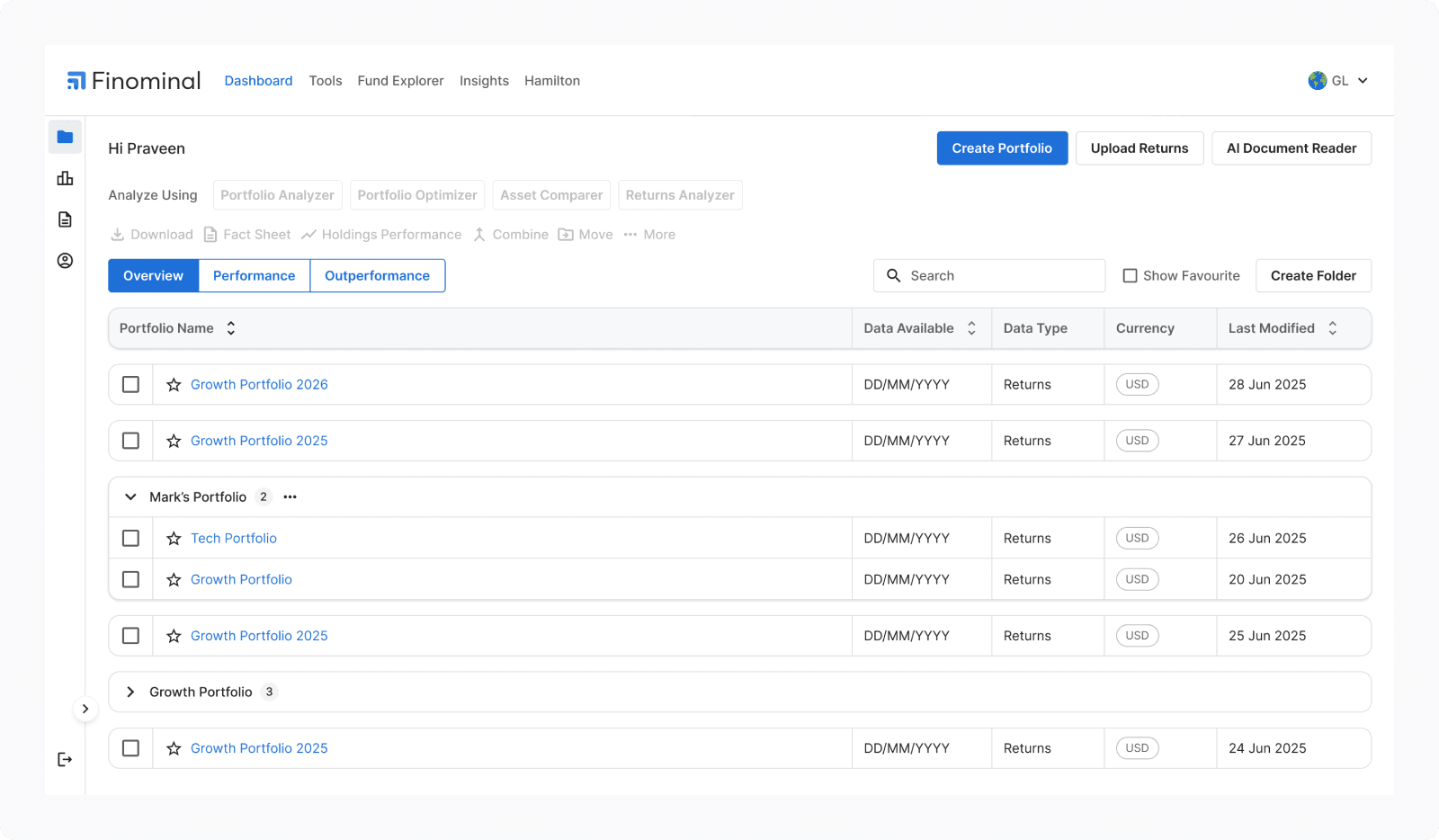
About the Project
Finominal is built for professional investors like Portfolio Managers, Advisors, Distributors, and Family Offices. Existing tools either oversimplify or overwhelm. Finominal tries to sit between both.
My Role
Owned the experience from strategy to shipping. Research, IA, interaction design, and QA, with no other designer on the team.
Skipped the usual design-to-dev handoff. Iterated directly against production data and shipped UI changes myself using Claude Code.
The Problem
When I joined, Finominal was live with paying clients and carrying significant design debt. The product had grown feature-first. Data existed but decision support didn’t.
Problem 1
No information architecture
Problem 2
Every data point, equal weight
Problem 3
Comparison required five screens
The debt was not in the code. It was in the gap between what advisors needed to decide and what the screens let them see.
My Approach
AUDIT
Map every flow
I mapped every flow, screen by screen. Documented clicks, dead ends, and repeated patterns. No IA existed so building one was the first move.
SIGNAL FILTERING
Separate noise from signal
Feedback came through Slack, mostly sales demo notes. I filtered for workflow failures, not feature requests. "Can we add X?" was noise. "They opened Excel to do Y" was signal.
ITERATE
Redesign, repeat
Audit, identify root cause, redesign, repeat. Decisions made directly with the founder.
How might we make complex portfolio analysis feel effortless for professional investors, without stripping the depth they depend on?
This meant reducing friction in portfolio creation and analysis workflows, presenting data in ways that aid interpretation, and restructuring the IA so the right data surfaces at the right time.
01Fund Explorer
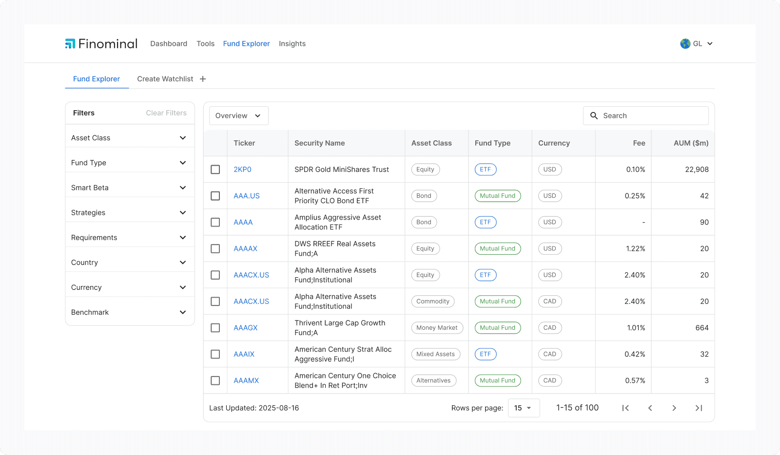
Users were struggling to find what they needed. Navigation complaints were coming in, and we were already moving to a new design system. That combination made a full redesign worth doing rather than patching.
The Problem
Problem 01
Filters don’t scale
Problem 02
No column hierarchy
Problem 03
Tools with no entry point
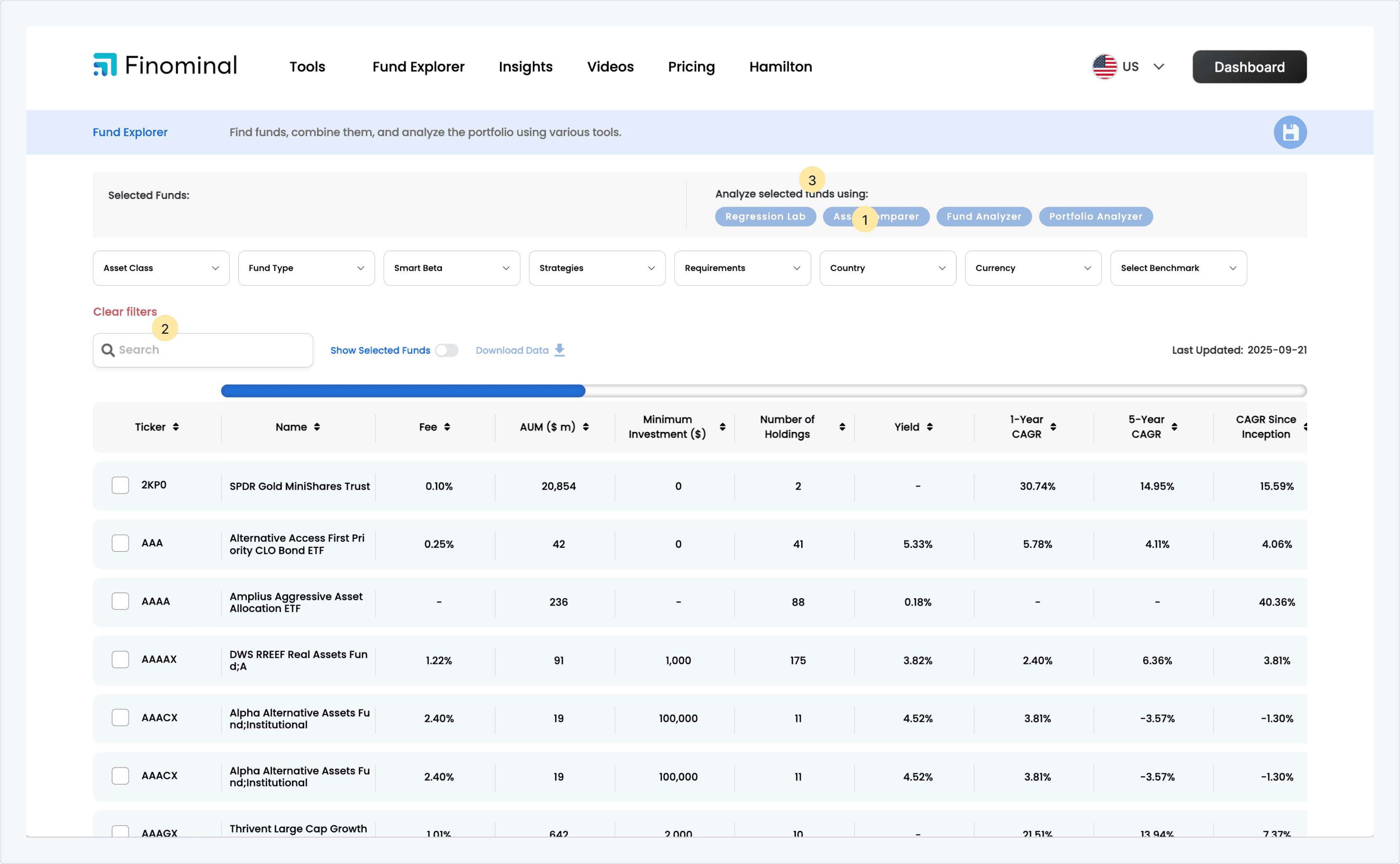
The table was correct. It just could not be used.
Iteration 1
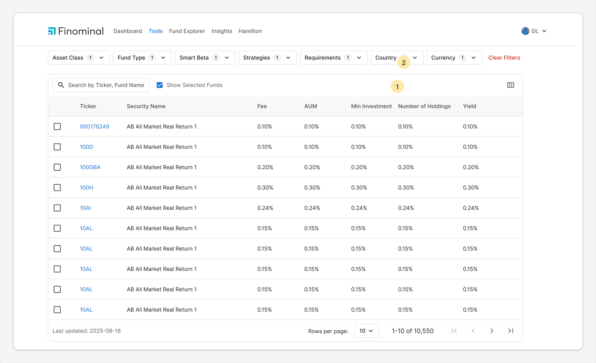
WHAT CHANGED
FEEDBACK
Column choices didn’t persist. Users noticed immediately.
Iteration 2
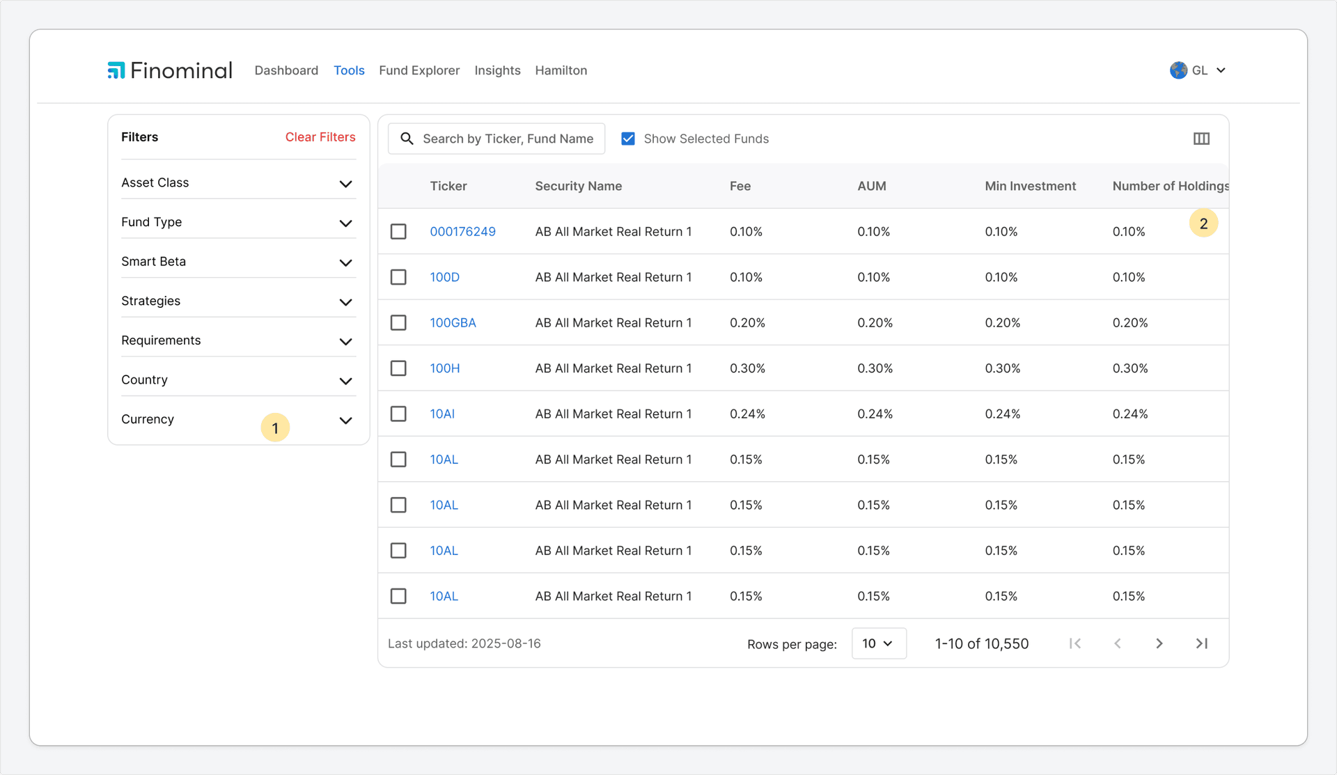
WHAT CHANGED
FEEDBACK
Sidebar helped filters. Columns pushed off screen hurt everything else.
I asked the team how they actually evaluate a fund. They move from identity to performance to risk. That sequence became the five groups.
26
COLUMNS
NO ORDER
Iteration 3
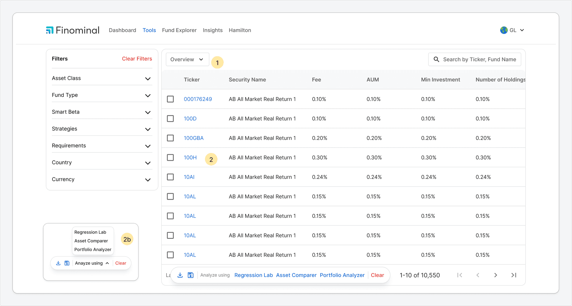
WHAT CHANGED
FEEDBACK
Team pushed back. No specific reason given.
Current
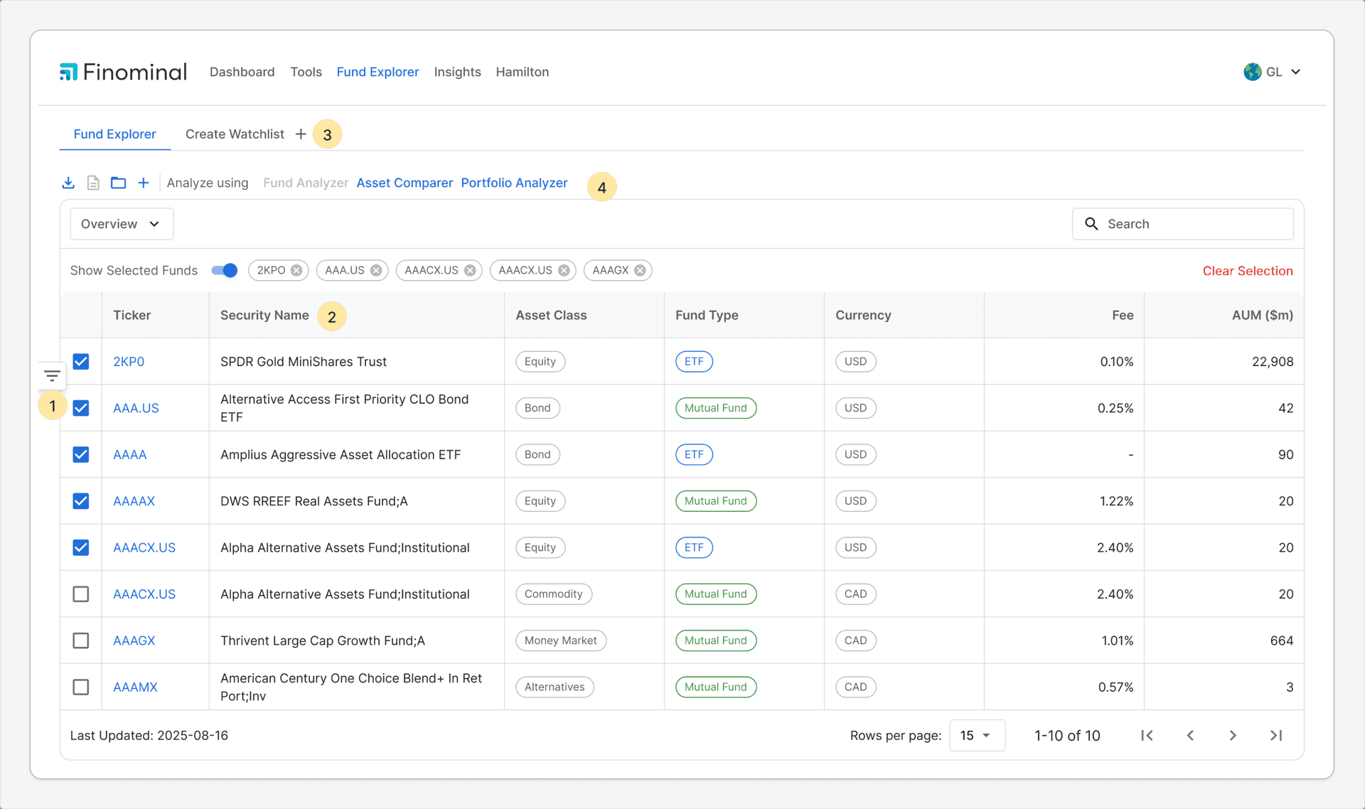
WHAT CHANGED
Designs
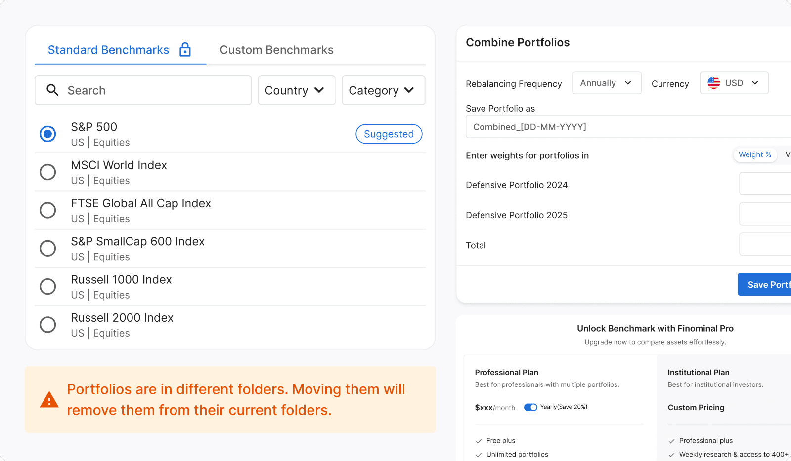
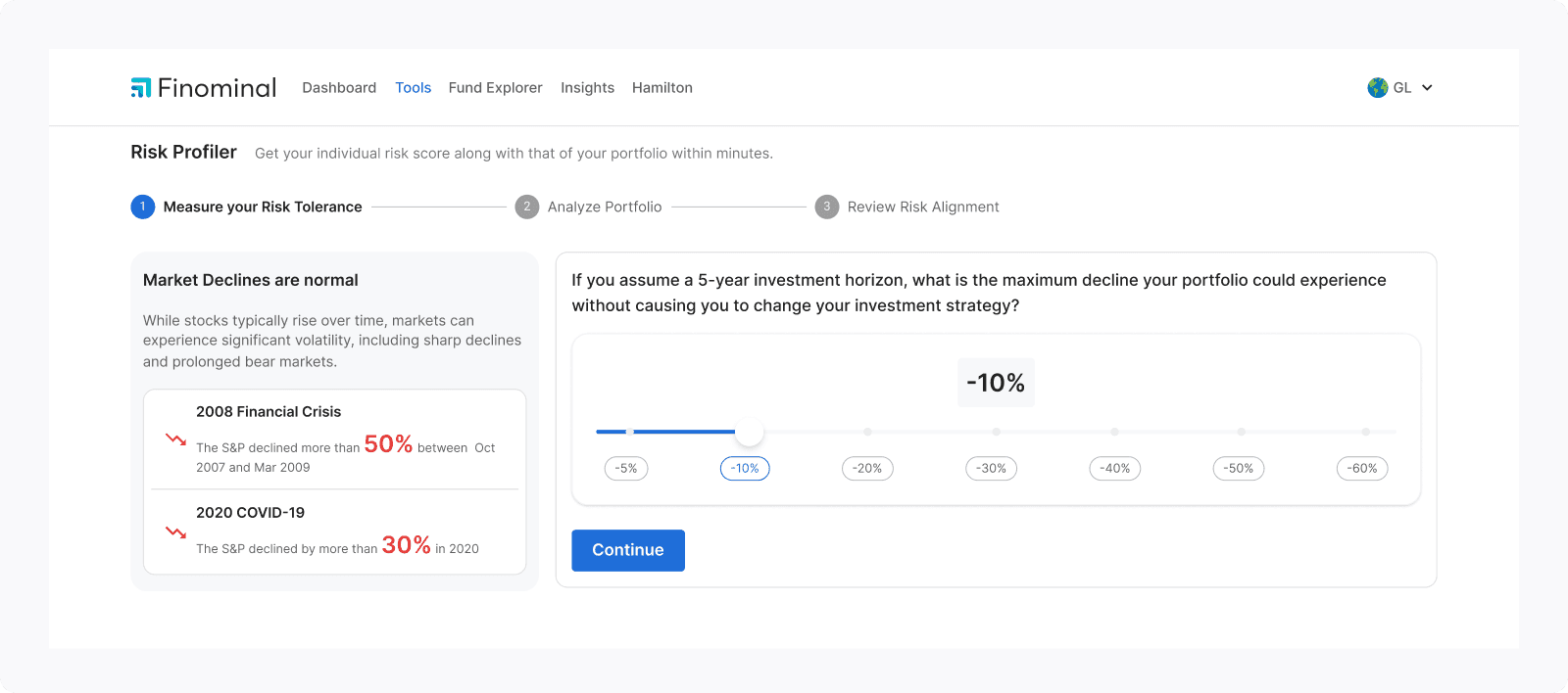
Outcome
Removed 2 tools that users had stopped using entirely. Revamped 8 tools across the platform for better navigation and usability.
Learnings
Shipping code yourself means you cannot design around ambiguity. Every edge case you did not think through becomes your problem to solve. Working without a PM taught me that being right about design does not matter if it does not move what the business actually needs.